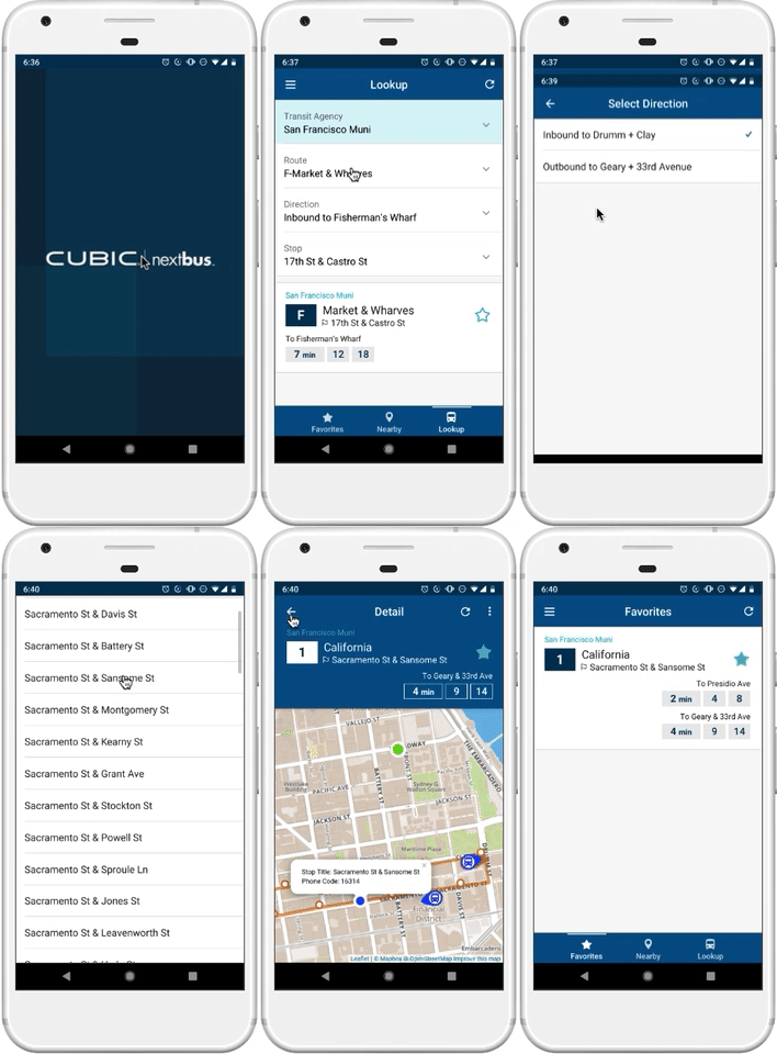
NextBus
Simplifying bus tracking for frequent Muni riders
ANDROID APP • USABILITY CASE STUDY
ANDROID APP • USABILITY CASE STUDY

CHALLENGE
NextBus is one of the most downloaded transit apps by Muni riders. It is also the force that funnels arrivals data to bus shelters. So how well can it answer, “when’s the bus coming?”
SCOPE
Market research, usability testing, pain point analysis, affinity mapping, information architecture, UX design, visual design, prototyping, validation testing
PROJECT OUTCOMES

APPROACH

EMPATHIZE

Market research
According to the 2016 SF Muni Ridership Survey, NextBus was the #1 Muni related app that survey respondents use. I also chose this app because I am a transit enthusiast, daily rider, but I would like to work on a product that is not 100% familiar to me.
Based on ratings data from Google Play and the App Store, Android is assumed to be the most used version. Therefore, my study was conducted, and design ideas were based on the Android version.
Guerrilla usability testing
In order to connect with other fellow Muni riders, I hit the streets of San Francisco on a sunny Sunday. I interviewed 7 users—in the 25-34 age group—at the following locations—cafe in NOPA, Alamo Square Park, Inner Richmond farmers’ market, and a bus stop on Divisadero. These users were new to the NextBus app, but they do use other transit related apps.
Scenarios
I asked participants to perform five tasks that involved looking up a nearby bus, specific route, finding the approximate location of a nearest bus, and adding favorites using the NextBus app. This allowed them to test the usability and its effectiveness in tracking nearby and specific bus arrivals.
SYNTHESIZE
Persona
A provisional persona was developed with the observations I made during my guerrilla usability testing. Majority of the participants I interviewed rely on Muni to get to work five days a week. They also may ride it more often to get around the city for fun.

Job stories
I developed a few job stories to get a better idea of the needs behind our provisional user Casey.

DEFINE
Affinity mapping
Once I processed all comments and feedback from usability testing, I highlighted call-outs from each user, and listed them out by name. Then I proceeded to evaluate by grouping the common problems together. It formed the bar graph below, and called attention to some top pain points.

Task flow analysis
Before I started the ideation process, I surveyed the steps it took in the existing app to complete the tasks of looking for a nearby route, finding a specific route and also favoriting a route. Shapes in red below are parts where most users had trouble with.
Current flow highlighting some tedious areas of the NextBus app.
Redesigned task flow
After the ideation process, I revisited and updated the previous task flow to illustrate the new design’s flow. In doing so, it helped visually validate how the redesign helped streamline the steps it take to get arrival times, and favoriting a route.

Revised flow—more compact and contained after redesign. There are multiple short paths to add favorites!
KEY PAIN POINTS
IDEATE
UI sketching
After the four key pain points were determined, I sketched out variations of screens that the key pain points involved. Since the Nearby screen is the first screen users see, I started out sketching this screen first, then narrowed down what the new navigation could look like.

Nearby screens sketching where I also explored other ideas for main navigation.

Reimagining Transit as Lookup

Adding a sense of welcome to the empty Favorites screen.

Applying the type blocks variations for individual route arrival times to the Detail page.
BUILD
Prototype
I leveraged my UI sketches to get feedback its on the clarity of the navigation, naming, and visual changes I ideated on. Then I proceeded to build an interactive prototype using Sketch and Marvel. I used this prototype to conduct validation testing. Throughout testing and prototyping, I continued to iterate to ensure the user’s experience continues to be improved.

OUTCOMES
Below are comparisons on how the four pain points fared after my recommendations were implemented.


VALIDATE
Once my NextBus prototype was ready, I went out in the field to test and validate my solutions. I tested with another 7 people in the Financial District of San Francisco, while they were waiting for Muni.

REFLECTION
As a transit enthusiast and fellow Muni rider, guerrilla usability testing other riders on the functionality of the NextBus app was eye-opening. Riding the bus in San Francisco already has its hurdles, yet even finding bus arrivals for routes with technology doesn’t make it easier.
Once I started the redesign process, I was also sympathetic to the challenges in organizing a large amount of data, and the thoughtfulness needed in handling the different permutations of a mass transit system.
The pain points that surfaced from my research were clear, as they were common among most tested users, and these problems hinder the key purposes of the app. Due to the wide demographic NextBus serves, it would be valuable to continue to iterate and test to ensure the app is usable across other user groups that the persona in this case study did not cover.
If an opportunity was present, and time and resources were abundant, I’d love to explore these ideas to further improve the NextBus app for bus riders:
Improve the onboarding experience to show users more features of the app, such as setting radius for nearby buses.
Provide option in Lookup/Transit screen to show only local transit agencies instead of NextBus’ entire network.
Develop feature to provide bus directions by destination search. Although this would be a costly and time intensive feature, a lot of participants I tested with thought the app would be able to do this, so riders won’t need to use another app in tandem to help them get where they need to go.